 “Album covers are like any other vehicle, they are a means of illustrating a story”.
Peter Blake
The fabulous cover for our new CD – “Winter Blue and Evergreen” was created for us by Toronto-based musician and artist – Martin Springett.
That we ended up with such an excellent and fitting cover is entirely down to the Chanteuse. She describes how it came about:
“How I was connected with Martin is through a friend and work colleague of my husband’s named Joan Steacy. Joan is an award-winning graphic novelist and instructor at Camosun College’s Comic and Graphic Arts program. Joan was over one day and I had her listen to a track from the new ‘Anam Danu’ album. She said the music reminded her of her friend Martin’s music, and then she explained that he was also fabulous graphic artist who had done album covers for his band, and other bands, as well as being a children’s book illustrator“.
The Chanteuse investigated Martin’s website and found that the style of his artwork fitted with thoughts that she already had in mind for the CD cover. Joan put the Chanteuse in touch with Martin – she called him and introduced us and asked if he might be prepared to take on a commission for us. Having listened to some of the tracks from our first release – “Winds of Change” – Martin most kindly and generously agreed to take on the project.
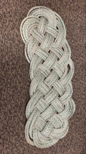
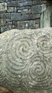
Martin and the Chanteuse engaged in an email exchange to determine the elements that the cover should include. Martin sent her examples of previous works in similar styles to those that they were discussing and the Chanteuse sent him images of Celtic designs that she had sourced.
Common ground having been agreed upon, Martin quickly came up with some initial ideas as to the form that the cover might eventually take. These lovely drawings show how it rapidly evolved. (Note that we had clearly at that point not settled on a final title for the album!).
Martin wrote of making the figure “more lively“; of creating “a big gesture that would flow across the square shape“. This is what he came up with:
We loved it and immediately gave it the thumbs up. We loved the flow and movement of the Goddess herself – we loved the elements of the circle of life that have been incorporated and we loved the way that Martin had pulled into the image ideas and themes that we had addressed in the songs on the album.
We eagerly anticipating seeing the finished cover. The process by which Martin turned his draft into the finished artwork will be the subject of my next post.
Tags: Anam Danu, Art, Martin Springett, Music


Recent Comments